
Behind the Brand: Nicole Lela Green
Brand statement
Nicole Lela Green is a social media content creator & influencer who seeks to use her platform to inspire, encourage, & motivate women.
BRAND BUZZWORDS
Authentic, Warm, Confident, Driven, Optimistic
Working with Nicole was such a joy. We always say that we get to work with the coolest people around and Nicole is such a great example of that! We so enjoy following along with her and her family on Youtube and Instagram and love the energy that she brings to her online community. It was such an honor to work on her rebrand from “Nicole and Richie” to “Nicole Lela Green” in order to help her really push towards the unique goals and dreams set on her heart and to help her reach her audience in ways that, like her, are clear, captivating, and authentic.
More About Nicole
Nicole Lela Green is a social media content creator who seeks to use her platform to inspire, encourage, & motivate women. She works primarily through Youtube and Instagram and shares everyday life in an authentic way – sharing the beautiful, challenging, fun, and even mundane moments of life in a way that is filled with genuine joy & gratitude. The main tenets that she naturally shares from her life are faith, family, and lifestyle. She creates connection and community with women from diverse backgrounds all over the world, and her faith inspires a sense of purpose and motivation.
OBJECTIVE
– Transition from “Nicole and Richie” to “Nicole Lela Green” in a way that stays family-focused and true to Nicole & her audience
– Establish clarity in direction for the Nicole Lela Green brand
– Expand visually on the established values – authenticity, trust, optimism, purpose, and approachability
– Create branding that has room for growth as the brand grows in order to maintain longevity and trust
– Design visuals that like Nicole’s personality and content, feels like talking to a friend
PROCESS
The first step in the process was to do an audit on the content being shared and the goals for future content. We established a brand vision, looked at goals, target audience, and the unique things that speak to her audience clearly and directly. We uncovered the golden threads that set the brand apart, and we focused on those attributes in order to clearly communicate with her viewers not only the type of content that they’ll receive, but clearly communicate its voice and values in a way that speaks to them naturally. Once establishing all of these pieces to be used in all areas of communication from Nicole Lela Green to her viewers, we began designing pieces that would be an extension of that voice and direction.


Overall Creative Direction
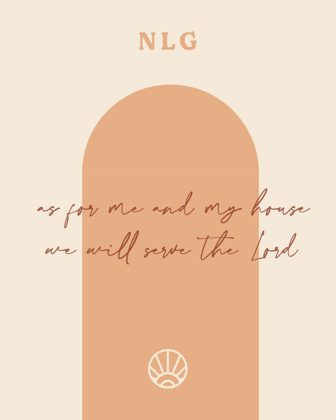
The visual inspiration of Nicole Lela Green should reflect all of the selected brand buzzwords. . The brand should be unique, creative, stylish, down-to-earth, and optimistic. All decisions – voice, color, font curation, imagery, layout, and illustrations – should reflect an authentic, warm, confident, relaxed, and optimistic nature.
The overall style was inspired by great, timeless vintage finds at a thrift shop, a comforting classic at an old record store, and the feeling of being at home even in a new place. It’s warm, feels both new and familiar, and has a quality of timelessness in order to achieve longevity. There should be a feeling of personal one-on-one connection – her viewers should come feeling welcomed and leave feeling inspired and encouraged in their daily lives, faith, and purpose.
Logo Mark
The logo should represent all of the brand buzzwords – authentic, warm, confident, productive, and optimistic. We sought to create a mark that would be vintage—inspired, yet modern, and would feel approachable but also aspirational and energetic. The chosen symbol came from exploration of marks that could represent faith in an unexpected way, and the brand’s uplifting and aspirational nature. It is bright and energetic, with a stylized treatment that speaks to Nicole’s creativity. It is rooted in meaning, is forward-reaching, and feels simultaneously vintage and modern. The timeless aspect allows it to grow with the brand as a memorable piece that represents the brand’s values and characteristics while also giving a glimpse of Nicole’s bright and energetic nature. The mark and word mark could be used in conjunction with the word mark, or on its own for flexibility of usage and ease of brand application.
Custom Family Illustration
Family is at the core of Nicole’s brand, and we sought to represent that in a way that is artful and unique to her. We created an illustration made with a single continuous line – connecting each family member and holding them together in a single, unified unit. This piece can be used on its own, or in conjunction with the other brand elements.


Color
Like Nicole, the primary colors should feel warm, approachable, energetic, and grounded. Colors should draw viewers in, making them feel at home, while also maintaining a clear and distinctively memorable look and feel.
Typography
The typography that we’ve selected is vintage-inspired. It feels nostalgic and familiar while also staying timeless and down-to-earth. The retro serif font paired with a slightly more modern sans-serif work together to create a comfortable, but energetic look and feel. Together, they create a warm, effortless, friendly pairing that feels simultaneously vintage and modern – like a timeless thrifted classic. The handwritten script adds a human touch – adding to our goals of personal one-on-one connection and trust.


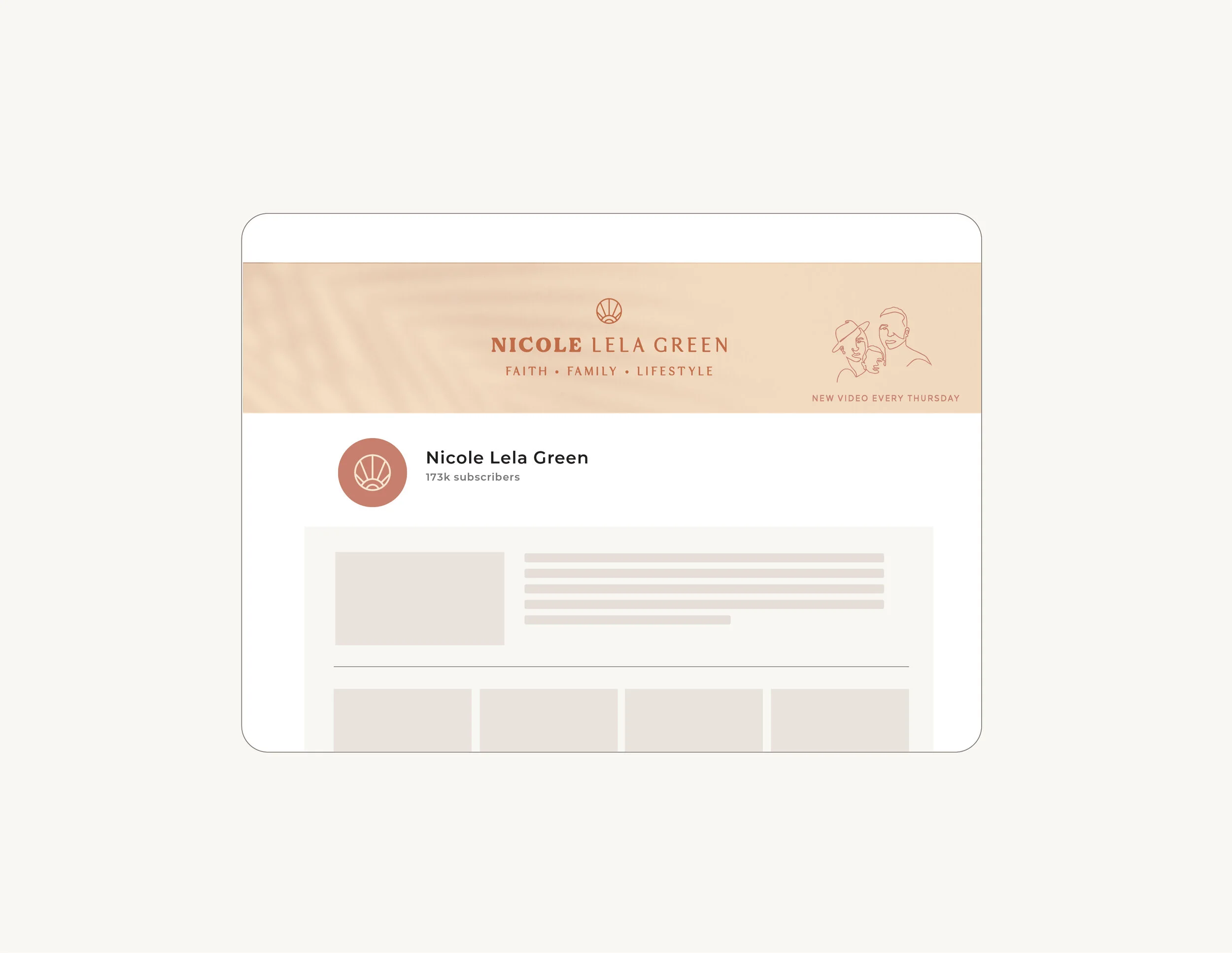


Templates & Collateral
We worked to create pieces at various points of contact with Nicole’s viewers that would remain true to the established brand while also remaining functional.
These pieces are an extension of her brand and also serve as an example of the kind of illustrations and pieces that can be used.
Outcome
We were thrilled with the direction that the brand took, and see it as a true representation of who Nicole and her viewers are. It is authentic, honest, and forward-reaching, holding true to the attributes of the Nicole Lela Green brand. Through many initial sketches and options, we worked together with Nicole to refine the direction until we found the exact angle that met all of our objectives. We’re so grateful to have had the chance to work with someone that so clearly seeks to be a positive voice that inspires, encourages, and adds beauty and gratitude to women’s lives, and we’re so honored to have had the chance to create a brand with Nicole that represents those values. We're so excited to see the beautiful things that Nicole and her viewers will do next!
Kind Words
“Before I hired Bonica Design, I had a brand without the look. It was incomplete. I was missing color, patterns, logos, fonts, all the important design elements that draws someone in and helps them always recognize you! Their team helped me identify who my ideal audience is, what my purpose is, and what my overall look & feel is. The process was fun, informative, and affirming that I was taking the correct next steps in my business. I have recommended Bonica Design to many people, because I truly believe they have a brands best interest at heart.”
Hear it from Nicole! :)
Hear from Nicole about her rebrand & experience here!